PhyloGeoViz
Want to put pie charts on a map? Then PhyloGeoViz is the application for you.
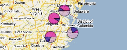
PhyloGeoViz is a web based application that plots any sort of frequency data with a geographic component. It was designed to create geographic visualizations of DNA haplotype data that are often used in the course of phylogeographic analysis. These visualizations demonstrate the spatial distributions of each haplotype, the frequency of each haplotype in each population, and the number of samples included per population. However, the program can be used for any kind of data.
Note! PhyloGeoViz has been tested and runs successfully in Firefox and Internet Explorer (some functionality limited in IE). Safari and Opera users -- development continues to get it working there too. Also, please note that the colorpicker functionality is buggy. A work around is to download the map into Google Earth and change the colors there. Please check back!
Version 2.4.5 is up and running! Uploaded 6/7/2012. KML syntax is fixed, so you can once again export to Google Earth and have the pies appear properly. Also, polygon draw order is fixed, so colors should not change when changing pie elevations in Google Earth.
How to Use PhyloGeoViz
-
Import Haplotype Data
PhyloGeoViz takes as input the haplotype frequency data for each locale. Locale data includes the latitude and longitude, and the number of individuals for each haplotype. All values should be separated by whitespace (space or a tab). Each population’s data goes on a separate line. If you’re not using this for haplotype data, consider 'haplotype' to refer to the different categories you want each pie slice to reflect. For instance, for four populations with three (haplo)types, data should be formatted like this:
popA 35.929673 -78.948237	3	2	5
popB 38.889510 -77.032000	5	1	4
popC 38.032120 -78.477510	0	1	9
popD 36.379450 -75.830290	7	2	1
-
Generate Visualization
PhyloGeoViz will convert the haplotype frequency data into pie-charts overlaid on to an interactive map. You can move the pie-charts, zoom the map, and re-center the map to customize the display of your data.
-
Export to Google Earth
Click Export as KML to export the visualization data in the Google Earth file format.
Learn More
PhyloGeoViz is sponsored by NESCent and Google Summer of Code 2007.
Developed By: Yi-Hsin Erica Tsai
Mentor: David Kidd
- PhyloGeoViz Project Weblog — Follow the PhyloGeoViz development effort.
- PhyloGeoViz Project Wiki — Check out the PhyloGeoViz design documentation.
- PhyloGeoViz @ Google Code — PhyloGeoViz is open source.
- Contact Erica Tsai — Want to report a bug? Or ask a question here.